Mastering Your iPhone Inbox: A Guide to iOS 18 Mail Management
The iOS 18.2 update introduces a revamped Mail app boasting intelligent categorization. While this automated system streamlines inbox management, you might prefer a traditional view or need to fine-tune the automatic labeling. This guide navigates the redesigned Mail app, offering solutions for viewing all emails and manually recategorizing messages.
Unveiling Your Entire Inbox
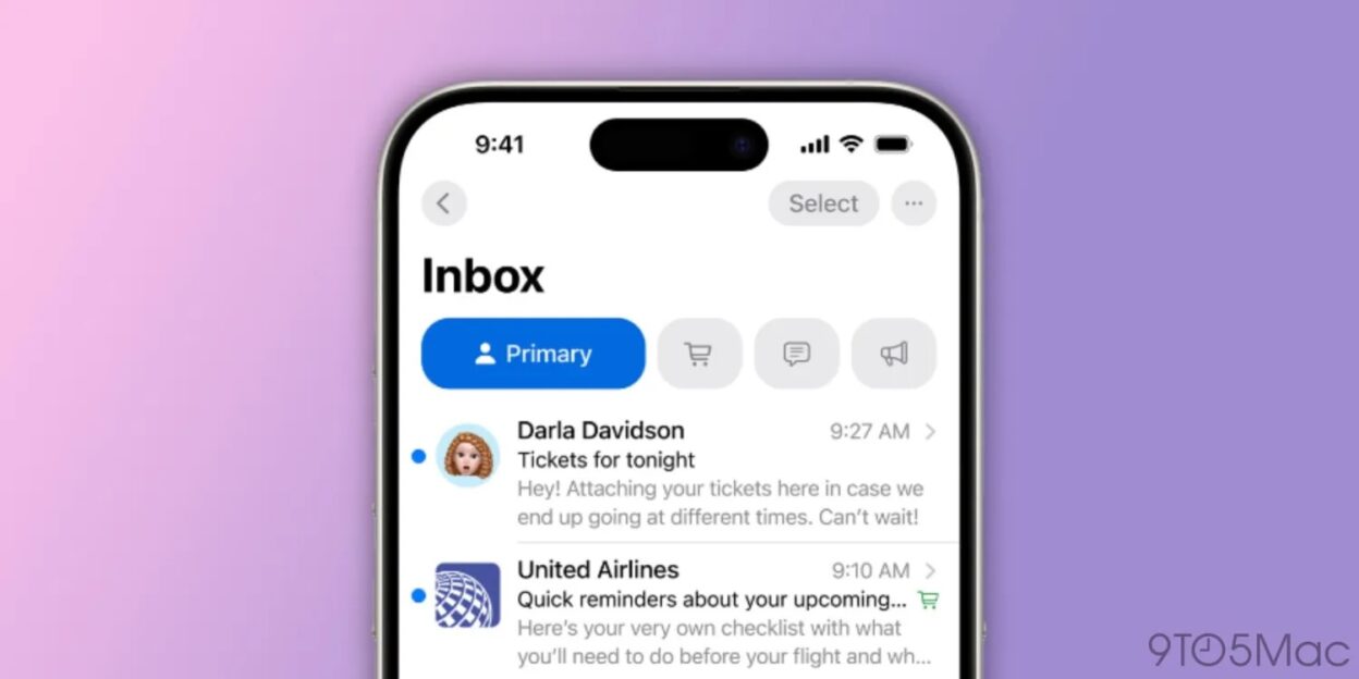
Apple’s latest Mail app intelligently sorts emails into categories like Primary, Transactions, Updates, and Promotions, aiming to highlight time-sensitive and crucial communications. However, sometimes a comprehensive view of your inbox is necessary. Here’s how to access it in iOS 18.2 (note that features may change as iOS 18.2 progresses through beta):
- Ensure your iPhone is running iOS 18.2 (or later).
- Open the Mail app.
- At the top of the screen, you’ll see the new categories, with Primary selected by default.
- Simply swipe left across the category tabs to reveal “All Mail.”
Choosing the Classic Mail Experience
If the new categorized view isn’t your cup of tea, you can revert to the familiar classic list view:
- Locate the three-dot icon (ellipsis) in the Mail app’s top right corner.
- Select “List View.”
- You can also disable “Show Priority” to prevent Apple’s intelligence from highlighting specific emails.
Refining Smart Categorizations
Prefer the new system but need to make adjustments? Here’s how to manually recategorize emails:
- For some emails, a three-dot icon (ellipsis) appears in the top right corner. Tap it and select “Categorization,” then choose the desired category.
- If the ellipsis is absent (common in the Primary category), tap the reply button. Swipe down to reveal “Categorization” and select the appropriate category. Crucially, manually recategorizing an email will redirect all future messages from that sender to the new category.
Understanding and Resetting Smart Categories
For a deeper dive into how Apple’s intelligent categorization works, and to restore default settings, follow these steps:
- Tap the three-dot icon (ellipsis) in the Mail app’s top right corner.
- Select “About Categories.” Here, you can explore details and reset the feature.
We hope this guide empowers you to manage your iPhone inbox effectively with the updated iOS 18 Mail app. Share your thoughts and experiences in the comments below!
More helpful iPhone tips and tutorials:
iPhone 16 Pro vs. iPhone 14 Pro: Is an Upgrade Worthwhile?
Customizing Lock Screen Controls in iOS 18
Utilizing AirPods for Hearing Enhancement and Testing
Activating iPhone Eye Tracking in iOS 18
Decoding Apple’s Visual Identity: The Evolution of the Apple Logo
Apple’s logo, a seemingly simple bitten apple, is arguably one of the most recognizable brand symbols globally. Its evolution reflects not only Apple’s journey as a company but also broader trends in design and marketing. This visual shorthand communicates a complex message of innovation, user-friendliness, and premium quality, instantly connecting with consumers worldwide.
From Intricate to Iconic: Tracing the Logo’s Transformation
The initial Apple logo, designed in 1976 by Ronald Wayne, depicted Sir Isaac Newton sitting under an apple tree. Far from the minimalist emblem we know today, this intricate design was quickly replaced. Steve Jobs, recognizing the need for a more modern and impactful image, commissioned Rob Janoff to create a new logo. Janoff’s design, the rainbow apple, debuted in 1977 and remained for over two decades. This vibrant logo, with its horizontal stripes echoing the then-revolutionary color display of the Apple II, resonated with the burgeoning personal computer market.
The Monochromatic Shift: Embracing Simplicity and Sophistication
In 1998, with Jobs’ return to Apple, the logo underwent another significant transformation. The rainbow apple was retired in favor of a monochromatic version, initially rendered in translucent “Bondi Blue.” This shift towards simplicity mirrored Apple’s renewed focus on sleek design and cutting-edge technology. The single-color logo, adaptable to various product finishes and marketing materials, projected a sense of sophistication and timelessness. Over the years, the monochromatic apple has been iterated in various finishes, from brushed metal to glass, consistently maintaining its core form.
The Power of Symbolism: A Bite of Meaning
The enduring question surrounding the Apple logo is the meaning of the bite. While various theories abound, including a biblical reference or a nod to Alan Turing, Janoff has stated that the bite was incorporated to ensure the apple was recognizable and not mistaken for a cherry or other fruit. Regardless of its origin, the bite has become an integral part of the logo’s identity, adding a touch of whimsy and memorability. This seemingly small detail contributes to the logo’s overall impact, making it instantly distinguishable and fostering a sense of familiarity.
A Modern Marketing Marvel: The Logo’s Enduring Legacy
In today’s saturated media landscape, a strong brand identity is crucial. Apple’s logo, with its rich history and evolving design, serves as a prime example of successful brand building. According to recent Interbrand rankings (insert current year and ranking), Apple consistently ranks among the world’s most valuable brands, a testament to the power and recognition of its logo. The apple symbol transcends language and cultural barriers, instantly conveying the brand’s core values and connecting with a global audience. This visual masterpiece continues to represent innovation and quality, solidifying Apple’s position as a leader in the tech industry.Please provide the article you would like me to rewrite. I need the text of the article to be able to rephrase it, restructure it, and add updated information while preserving the core meaning and optimizing it for SEO. I’m ready to create a unique and high-quality version once you share the original text.
